Branding the Protest
Freakshow is a fictional branding project exploring the accessibility of weapons and the impact of gun violence. The project was created as a personal response to the complexity of gun policy, focusing on the uncomfortable reality of how easily weapons can become part of everyday life. Through branding and visual communication, I wanted to create awareness and encourage people to reflect on this issue.
Client
Marc H.
Year
2024
Project type
Brand Identity & Campaign Design
My role
Concept Development, Branding & Graphic Design


Inspiration
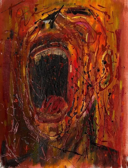
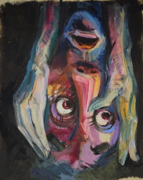
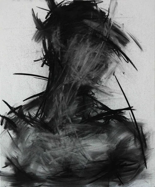
The inspiration for Freakshow came from the visual language of protest movements, editorial design, and underground culture.
I looked at how designers use strong imagery, typography, and visual tension to communicate serious topics and create emotional reactions.
The contrast between chaotic compositions, raw textures, and bold graphic elements helped shape the identity of Freakshow. These references guided the development of a visual style that feels uncomfortable, confronting, and impactful.
Concept
The concept behind Freakshow is built around the idea of discomfort and confronting reality.
The project explores the unsettling accessibility of weapons and the impact that gun violence has on individuals and communities. Instead of presenting the subject in a purely factual way, I wanted to create a visual experience that communicates the emotional weight behind the issue.
The visual direction focuses on distortion, chaos, and raw emotions. These elements represent the unpredictability and pain connected to gun violence and became the foundation for the entire visual identity.

Design
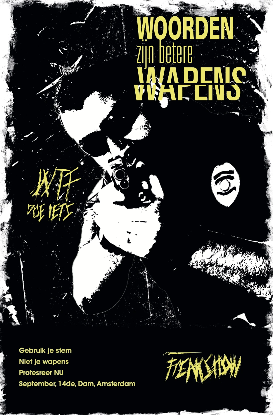
The final designs translate the concept of Freakshow into a visual identity that feels raw, confronting, and emotionally impactful.
Through bold typography, distorted elements, and rough textures, the designs communicate the uncomfortable reality behind the subject.

Brand Applications
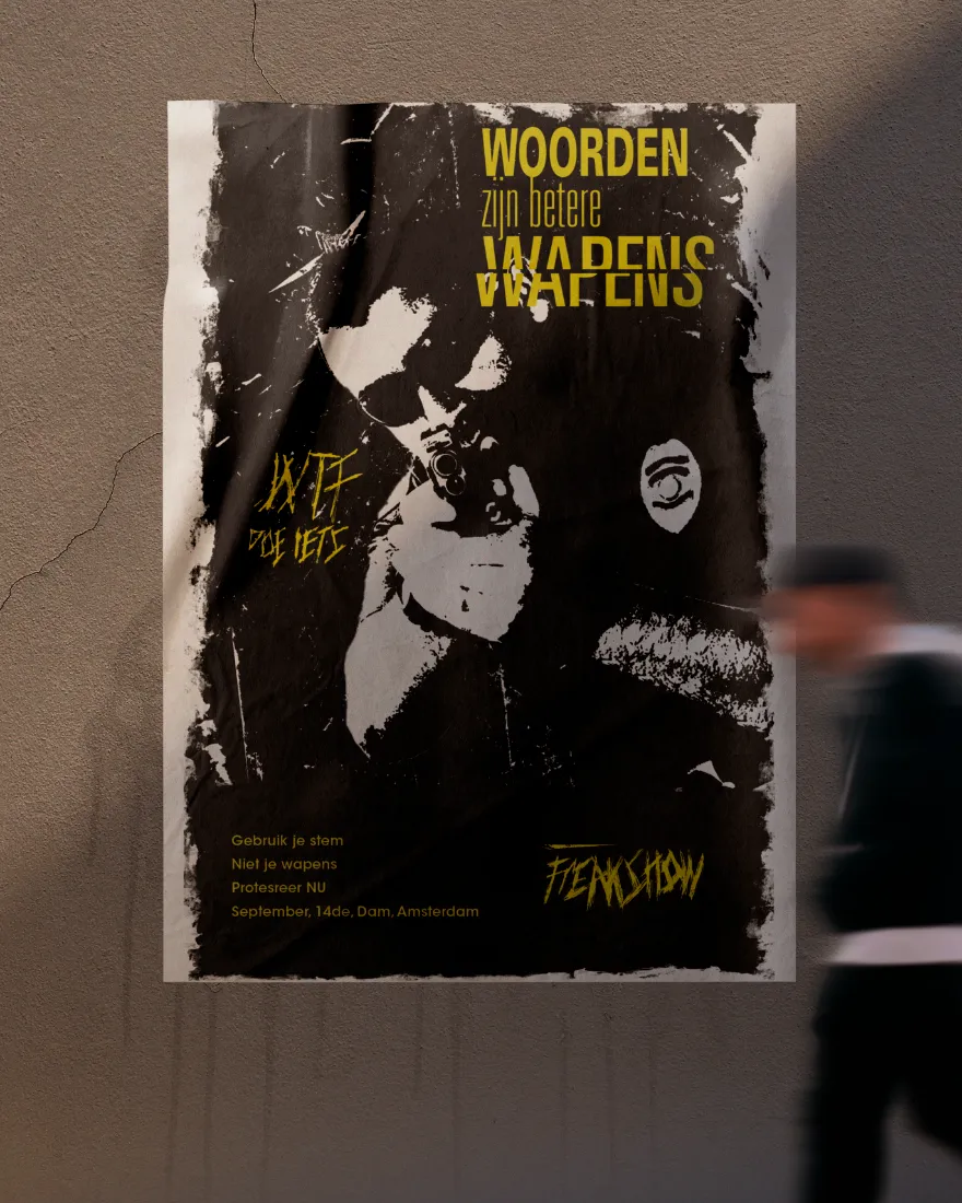
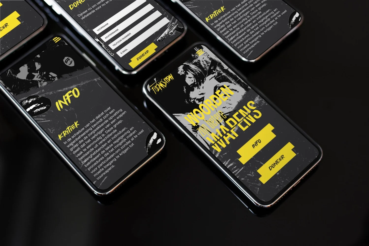
To demonstrate how the identity could exist beyond the initial designs, I applied the visual language across different brand touchpoints.
The posters, clothing, flags, and digital applications create a consistent identity while strengthening the message behind the concept.


Reflection
This project challenged me to design around a complex and sensitive topic while balancing visual impact with a meaningful message.
It taught me how design can be used as a tool for storytelling and communication, not only to create something visually appealing but also to make people think and feel.

Next project

De “NIEUWE“ School