De “NIEUWE“ School
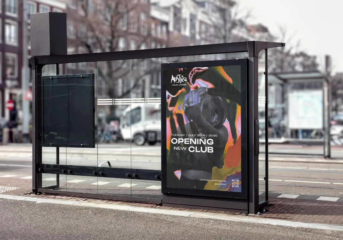
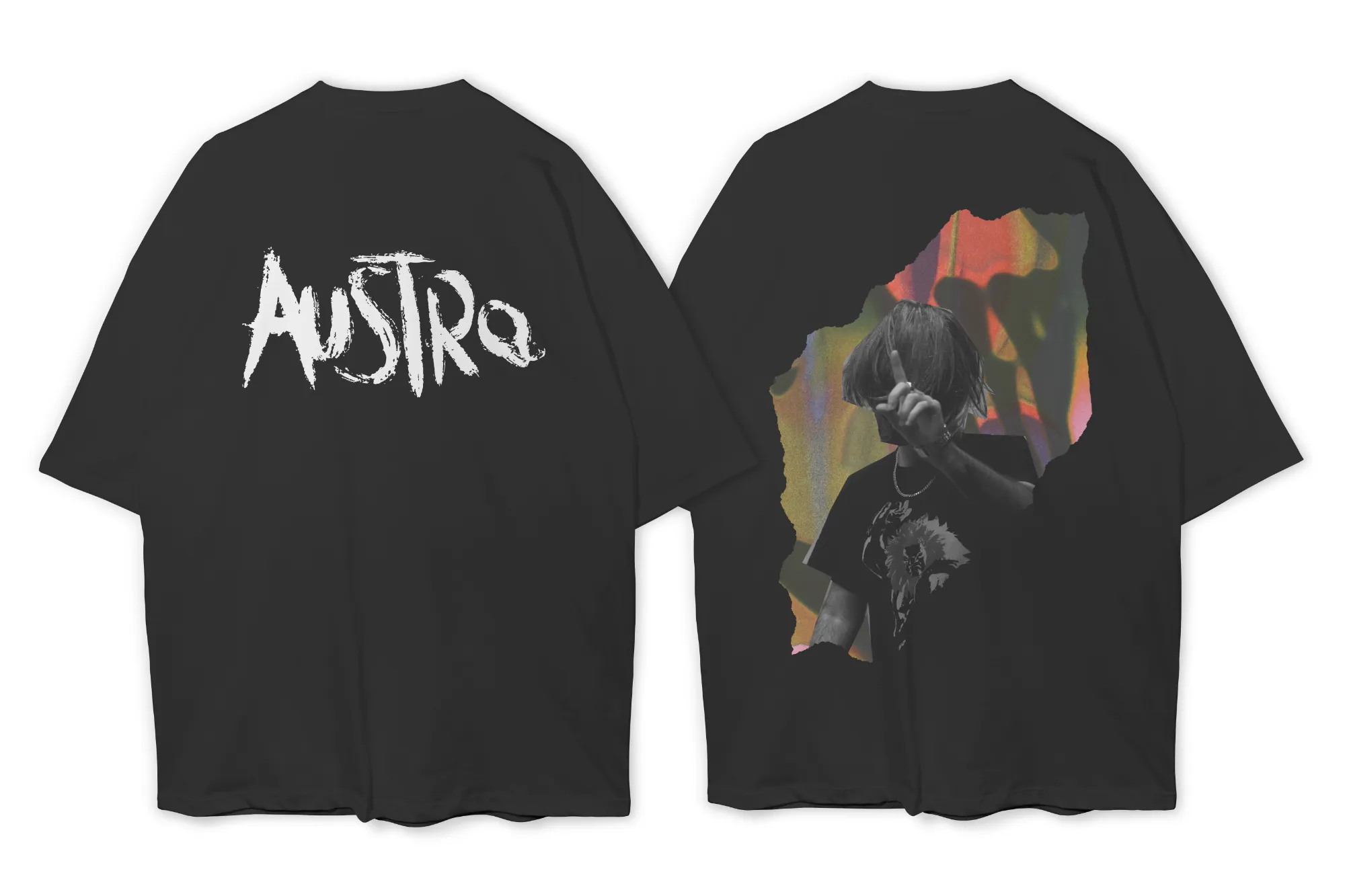
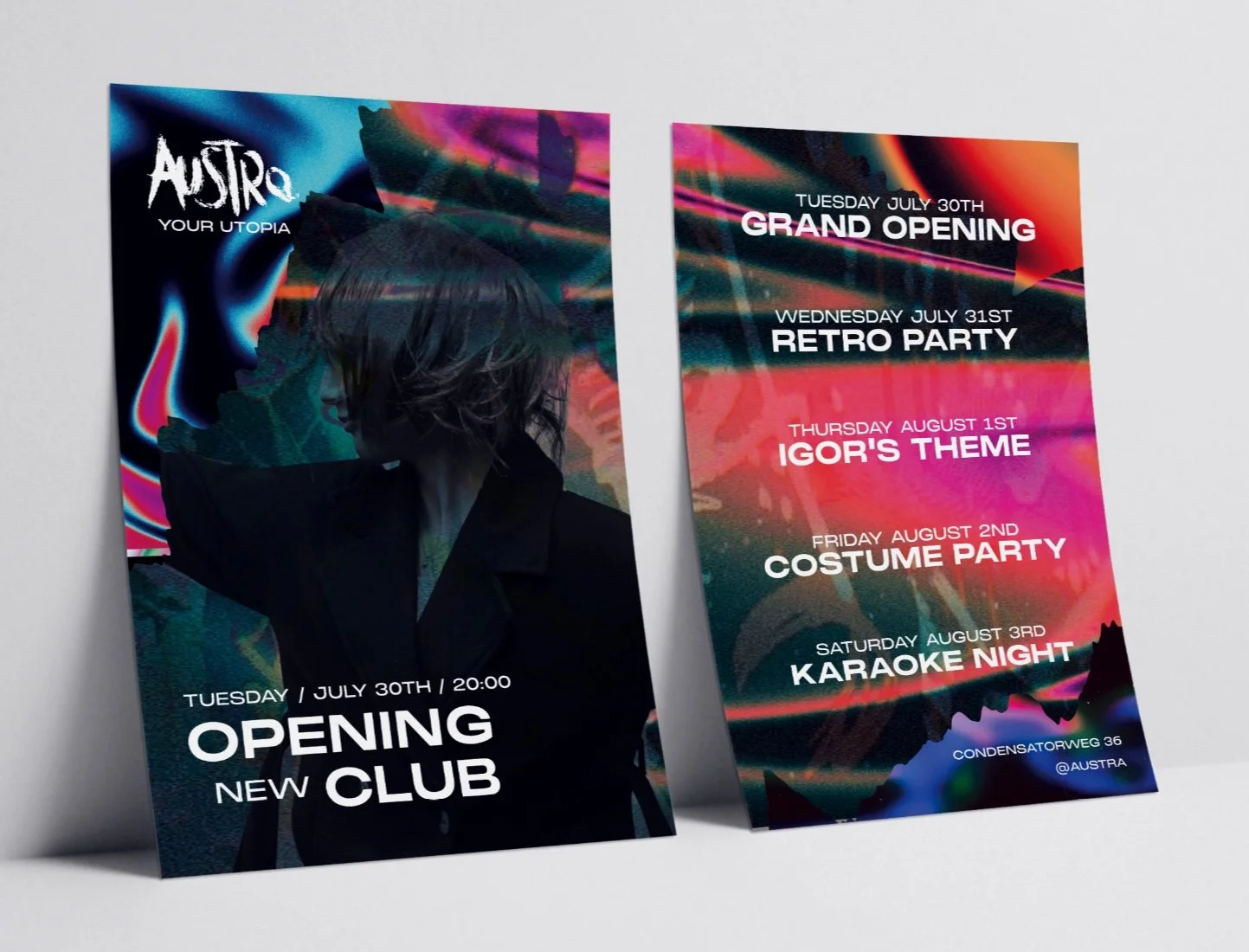
The challenge was to create a complete brand identity for a fictional cultural venue that felt fresh and contemporary while still acknowledging the legacy of De School. The identity needed to communicate a clear concept and work consistently across a range of applications, from posters and social media to merchandise and environmental graphics.
Client
Meike B.
Year
2024
Project type
Branding
My role
Visual Identity, Illustration, Graphic Design & Art Direction

Inspiration
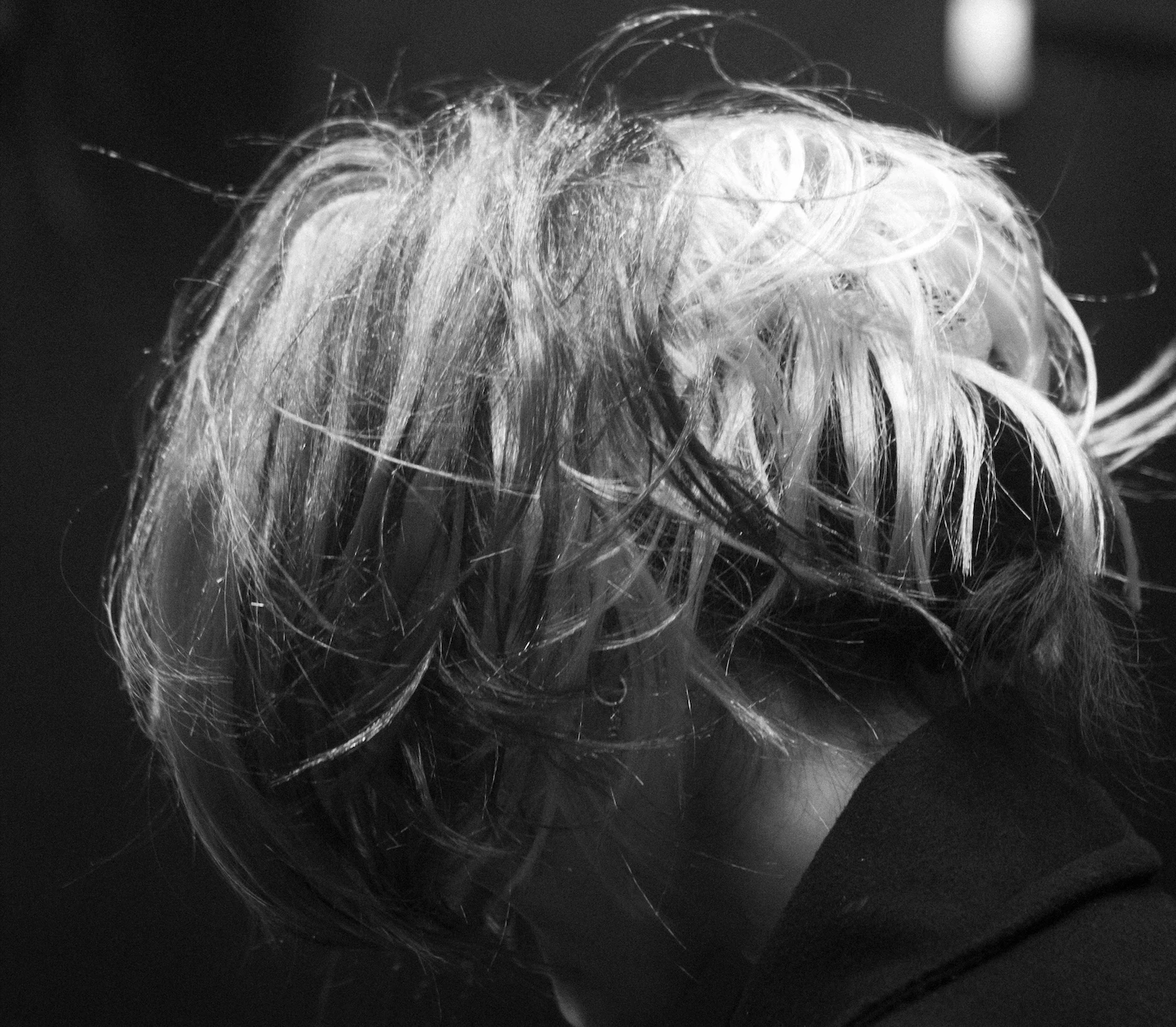
The inspiration for Austra came from Amsterdam’s nightlife, underground culture, contemporary branding, and modern graphic design. I explored visual references from clubs, festivals, editorial design, and experimental typography to better understand how different identities create atmosphere and emotion.
Rather than recreating the identity of De School, I focused on capturing the feeling of freedom, creativity, and self expression. These references helped shape the visual direction and formed the foundation of the final brand identity.



Concept
The concept behind Austra is built around the idea of freedom.
The word school is often connected to rules, structure, and following a predetermined path. With Austra, I wanted to create the opposite: a space where people can explore, express themselves, and create their own experiences.
The name Austra is a combination of aura and astro. It represents personal energy, curiosity, and the freedom to choose your own direction.
This idea became the foundation of the entire visual identity.

Process
The process started by translating the concept into visual ideas through research, sketches, and experimentation.
I explored different logo concepts, typography styles, compositions, and graphic elements to find a visual language that represented freedom and movement.
After testing and refining different directions, I developed a cohesive identity that could be applied across various media while maintaining a recognizable character.
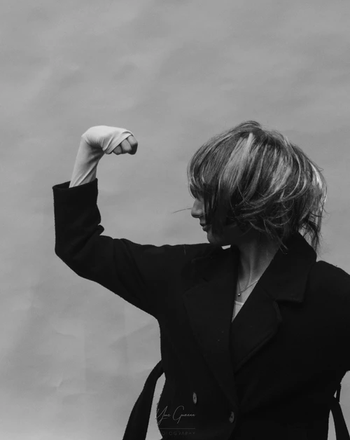
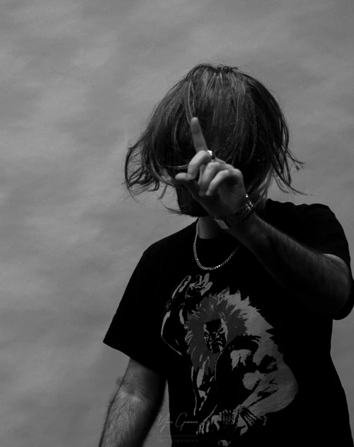
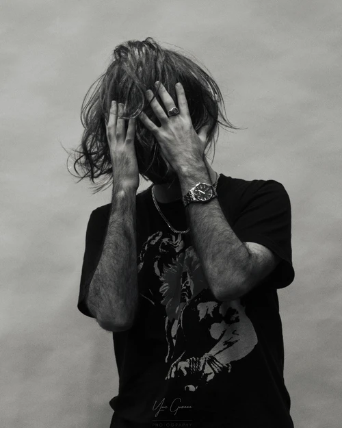
Design
The process started by translating the concept into visual ideas through research, sketches, and experimentation.
I explored different logo concepts, typography styles, compositions, and graphic elements to find a visual language that represented freedom and movement.
After testing and refining different directions, I developed a cohesive identity that could be applied across various media while maintaining a recognizable character.


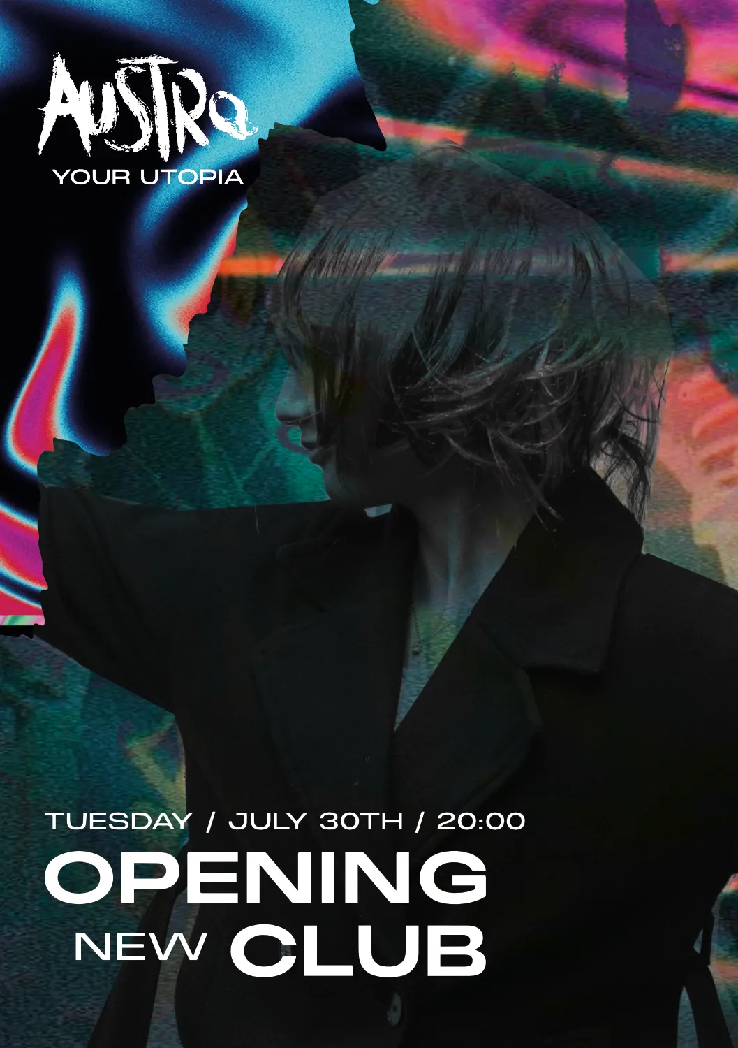
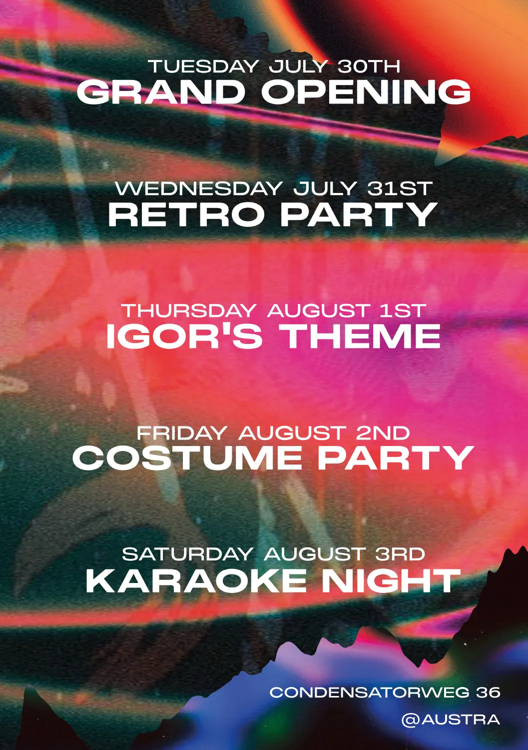
Brand Applications
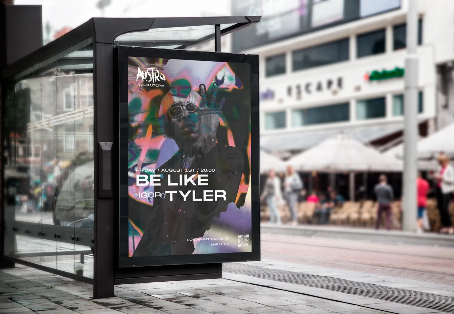

Reflection
This project helped me develop my skills in branding, visual storytelling, and building a design system from concept to execution.
One of the biggest lessons was understanding the importance of creating a strong concept before developing the visual direction. Every design choice should support the story and purpose of the brand.
Looking back, I would explore even more visual directions during the early stages and test the identity in additional real-world applications.

Next project

#MyBody